What’s in a brand: How values translate
Editor's Note: Stars Foundation is the convening partner of the With and For Girls Collective, made up of: EMpower, Mama Cash, NoVo Foundation, Plan UK, The Global Fund for Children, Nike Foundation, The Malala Fund, and Stars Foundation.This is the first in a three part series exploring aspects of the With and for Girls Collective. Subscribe to GrantCraft updates to make sure you catch the next two when they go live. For more on the Collective, please visit http://www.starsfoundation.org.uk/awards/girls-awards
Last month saw powerhouse Google undergo a controversial rebrand. The company – whose name, in a move indicative of its prevalence, entered the Oxford Dictionary in 2006 as a verb – changed its logo to better reflect its user offering and to announce that it will sit under a new parent company, Alphabet.
This bold move reflects two important features to consider when developing a brand. The first, the product’s unique selling point, and the second, the business need. In our philanthropy world, too, brand matters, and the same features apply. For a funder collaborative, developing a brand can be a useful tool not only for communicating what makes it unique and why it exists, but also for determining these structures in the first place.
The With and For Girls Collective is a group of eight funders who have committed a combined $1 million to an awards initiative recognizing strong locally-led grassroots organizations worldwide working with and for girls. Twenty winning organizations will receive up to $50,000 each in flexible funding and capacity building support. The winners of this inaugural year’s awards will be revealed in November.
Collective premise
As a group, we share a common belief: girls are agents for change. We unveiled the new With and For Girls brand yesterday, October 11, which is the Day of the Girl Child to symbolize that shared value. Yet as independent organizations, we have very different aims, values, and structures. As a collective of eight funders, creating a single identity has been a challenging but necessary process.
Taking the decision to create a unifying brand came easily. Since the Collective’s inception in January, producing external materials has proved quite the headache, often resulting in a mishmash of different logos sprawled across a header.
But beyond this basic functional need, we wanted our brand to mean something, something that could provide a powerful icon representing the story of the Collective and what it has achieved. While we are only now formally launching the brand, we have in fact been working together for the last twelve months to successfully identify strong, locally-led organizations working with and for adolescent girls.
The Collective’s hope is that the awards will amplify the voices of those less often heard – girls and leaders in locally-led development – showcase effective practice, offering positive proof of the enormous potential girls and the local organizations that support them have in empowering girls and young women. As a group, our aim is to engage with other funders to mobilize more and better resources for local, girl-led and -focused organizations. We also want to elevate and amplify the voices of these organizations among funders and in places of power.
Girl participation is at the heart of this award. The winning organizations are either run by girls or work in close partnership with girls. Indeed, the final stage of the 2015 awards process was conducted through five regional interview panels made up of adolescent girls. Girls – defined for our purposes as age 10 through 19, in Cairo, Dar es Salaam, London, Mexico City, and Mumbai had final decision-making power.
It seemed contradictory to create a brand that did not follow this participatory framework, so we embarked on a process that involved girls as brand advisors in a meaningful way.
Designing a process that worked
Our first challenge was to identify our stakeholders and our target audience for our communications for the award. As well as engage with other funders and elevate the voices of grassroots organisations in places of power we also wanted to create a feeling of a movement for the winning organizations. The logo will be used as a stamp by them to publicly showcase their exceptional girl-focused programming approach and their successful completion of a rigorous assessment process.
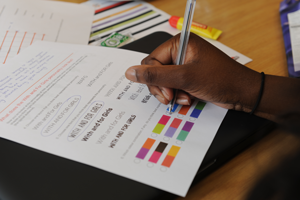
 We began by creating a Brand Working Group, which took responsibility for writing the brand brief. This was signed off by the funding partners and went to the design agency. We then asked the girl panelists to complete a questionnaire that had been translated into local languages. In total, we asked 31 girls and young women from Mexico, Egypt, Tanzania, the UK, and India about themes, keywords, colors, and shape options for the logo.
Questions were asked about the extent to which girls should be involved. While not the primary audience from an advocacy perspective, we consulted with the girl panelists at the end of the judging process. By this point, they’d seen the full range of organizations working across the globe on a variety of issues, so were able to advise on how a logo could portray the broad spectrum of organizations that were interested in the With and For Girls Award.
The design agency used this information to draw up four initial logo designs. The eight funding partners voted and took these down to two designs and provided feedback and further amendments. The final stage of consultation was with the twenty winning organizations (who have already been notified although we have not yet publicly announced their prizes) themselves, asking for their thoughts on the designs and for them to vote for their preferred option.
It has been exciting to compare and contrast the thought-provoking responses from girls all around the world. Different cultural ideals and a preference for certain aesthetics have appeared throughout the branding exercise. For example, a pattern to have emerged across the UK panel was the insistence of using images. One issue that came up time and time again was the use of the color pink. Is it too girly? What about its associated gender stereotypes? Is it time to reclaim pink? Another pattern to have emerged across all regions has been the insistence of using images that show power and activism and rather than anything that displays passive gender-linked icons.
The big reveal
Two clear favorites emerged. The first, the favorite of the winning organizations by 14 to 4 had a more “development sector” feel about it. The second, favored by the funding partners, had a more campaigning feel and potentially spoke to donors more.
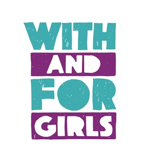
 After much deliberation, we went with the preferred choice of the winning organizations . The teal and purple was the first choice for many panelists, as it represents a fresh and bold approach to girl-led development. The color palette is bright, vibrant, and fun – like the organizations and girls we are seeking to empower.
The horizontal teal blocks represent an equals sign and will be used as a standalone icon across marketing materials. This logo has a grassroots, handmade feel, which represents the hand each stakeholder has had in shaping the awards. It was designed to look as though it was made by girls for girls. This avoids stereotypes as it does not impose any icon, and creates a new, empowering look for girls that they can call their own. The three most popular words the girl panelists chose to describe the Collective were inspiring, passionate, and creative. Aesthetically, the logo is fun and creative, but also expresses the campaigning element of the project. The bolder look and feel means it is instantly recognizable as a logo representing development work that focuses on youth.
Although this option was not my personal favorite, we have followed the process and most importantly listened to and respected the voices of the organizations we are aiming to elevate. What sets this brand apart from others in the development sector is the method that was used to design it. We have stayed true to our values and listened to the very people we have set out to serve.
Here are some tips based on what we learned for other funders and collaboratives engaging in a brand process:
- Manage expectations with stakeholders from the outset. Set clear timeframes and signpost where you expect and do not expect input from others.
- Agree on your brand brief and schedule before the process begins and get buy-in from key decision makers.
- Work with a design agency that understands your values. We chose to work with a female designer, and the agency took the time to sit in on a judging panel to better understand the process.
- Trust in the process. Be prepared to put your personal views aside and listen to the views of those you have gone to the effort of consulting.
- Do not underestimate the extent to which language can act as a barrier for involvement. Factor in time for translation and use shapes/colors strategically to help avoid cultural misinterpretations.

